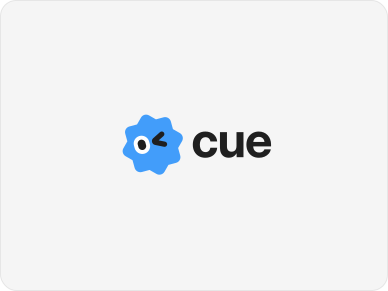
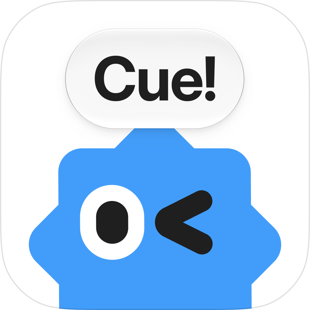
Our primary logo brings together the Cue character and wordmark. Use the version that stays clear and legible against your background, and always give it room to breathe.
The endorsed lockup pairs Cue with ‘by Manus’. Use this version when you want to make the connection to Manus clear. Keep the complete lockup together, with its original proportions.
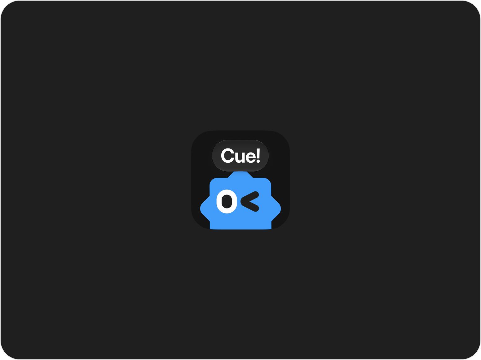
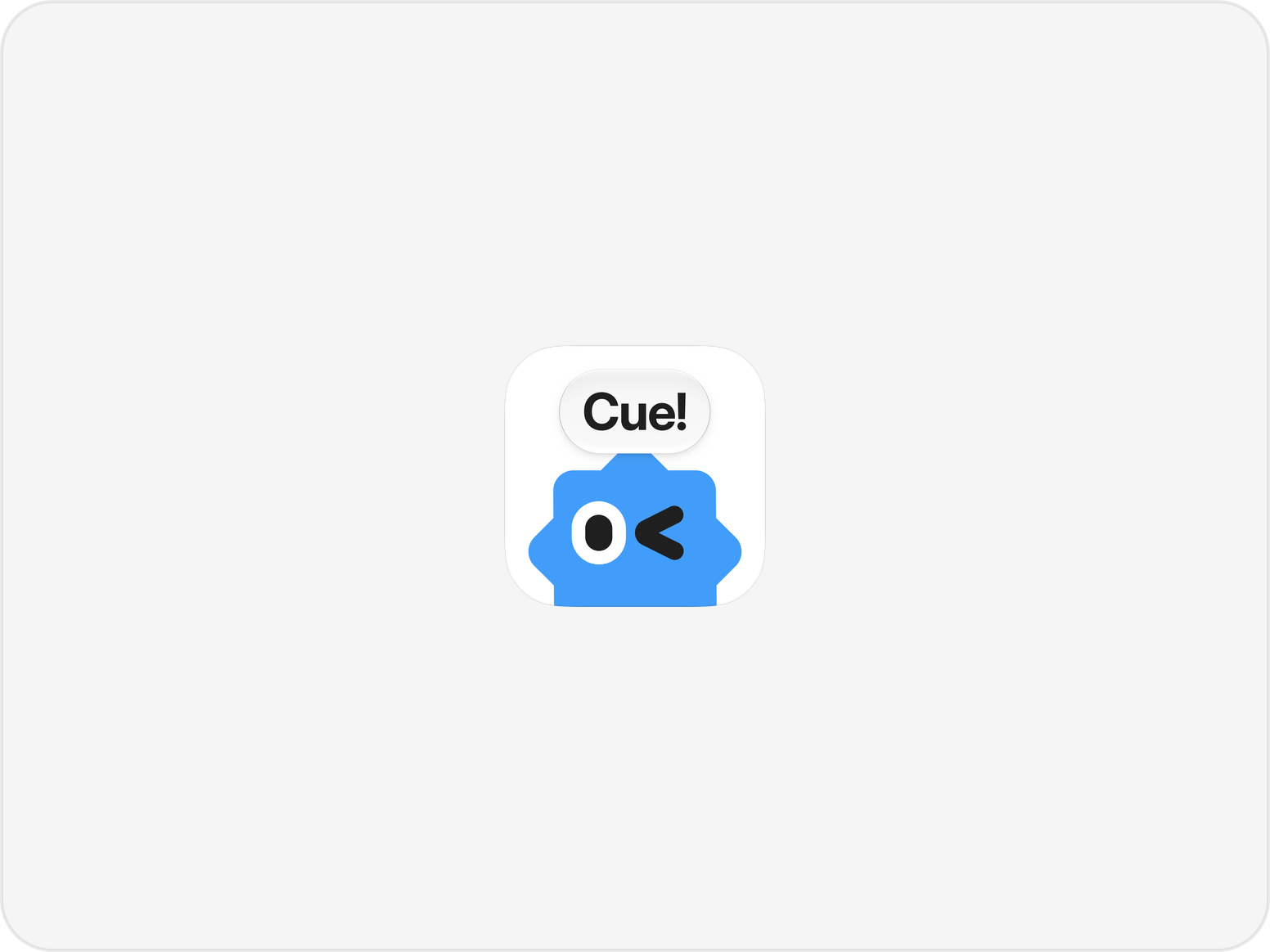
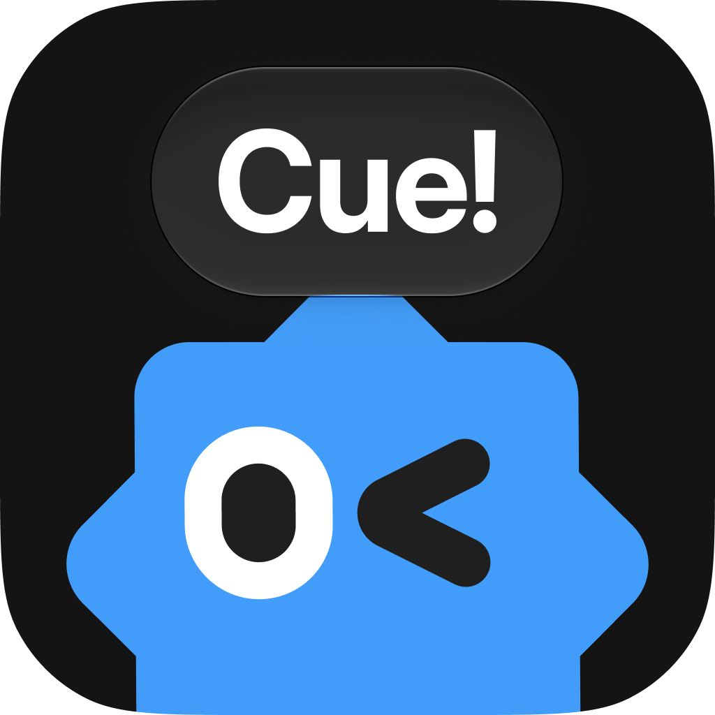
Use the app icon wherever a compact expression of Cue is needed, from app launchers to social profiles. Choose the light or dark version to suit its surroundings.
Our palette is built around three colors: black, Cue blue, and white. Together, they keep Cue clear, approachable, and instantly recognizable. Use these as the foundation of every brand application.
Black
HEX:
#1F1F1F
RGB:
31, 31, 31
CMYK:
0, 0, 0, 88
Blue
HEX:
#429DFA
RGB:
66, 157, 250
CMYK:
74, 37, 0, 2
White
HEX:
#FFFFFF
RGB:
255, 255, 255
CMYK:
0, 0, 0, 0
What not to do
Keep Cue looking like Cue. Use the supplied assets as they are, and avoid these treatments.
Don’t use other colorsDon’t rotate the logoDon’t flip the logoDon’t stretch the logoDon’t add effectsDon’t outline the logo